




~100%
YoY increase in new client enquiries since rebrand
95%+
Facebook reach lift on launch social activation
1
Agency built from zero — brand, site, social & systems
The challenge
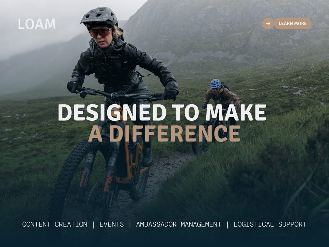
LOAM launched with no visual identity, no brand strategy, and no systems to manage digital or social output consistently. As a new agency competing for attention in the outdoor sports industry, it needed a distinct identity, a strategy tied to business goals, and a system that could scale across every channel without a design team behind it day-to-day.
The brief was mine to define: uncover what LOAM actually stood for, then build everything — identity, digital presence, and the workflows to run it — almost entirely solo.
How I approached it
- 01 Discovery workshopsRan sessions with the founders to uncover LOAM's essence — landing on "loam," the rich soil mountain bikers chase, as the metaphor for growth and authenticity that shaped everything after.
- 02 Visual identity & systemDesigned the logomark, typography and an earthy palette drawn from the Scottish Highlands, then built it out as a flexible system — usable from pitch decks to Instagram in a single afternoon.
- 03 Digital presenceDesigned and shipped a user-focused website and social templates in Figma, working through layout, hierarchy and component reuse so the team could self-serve new pages without breaking the system.
- 04 Systems & ongoing directionBuilt the workflows for producing on-brand content at speed, and continue creative-directing every project against the system today.
The identity system
A selection from the LOAM brand book — logomark construction, typography, colour system and applied collateral.


The outcome
LOAM’s new identity brought clarity and consistency across every channel, positioning the agency as the go-to for brands engaging the outdoor community. Since launch, LOAM has seen a ~100% YoY increase in project enquiries from new clients — and I continue to creative-direct every project against the system today.
Related Work & Projects
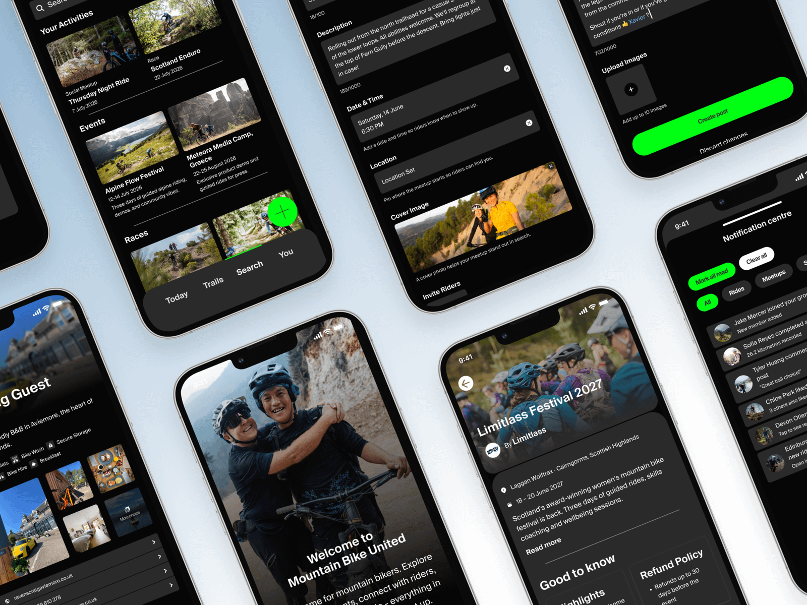
Mountain Bike United UX & UI Design
Defined the brand visual language, scaled it into UI design, and built the UX to support it — end-to-end design ownership for the global mountain biking community's all-in-one platform.
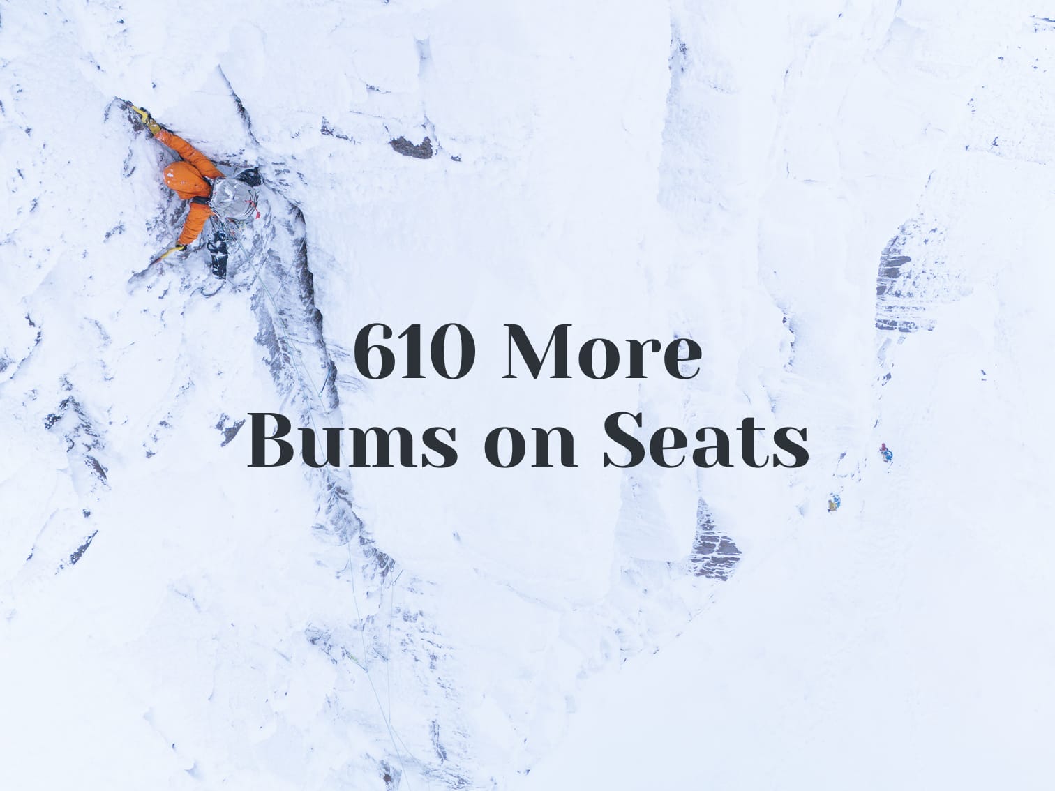
Mountain Festival content strategy
Led social activation end-to-end — +95% Facebook reach, +29% ticket sales against the prior year.
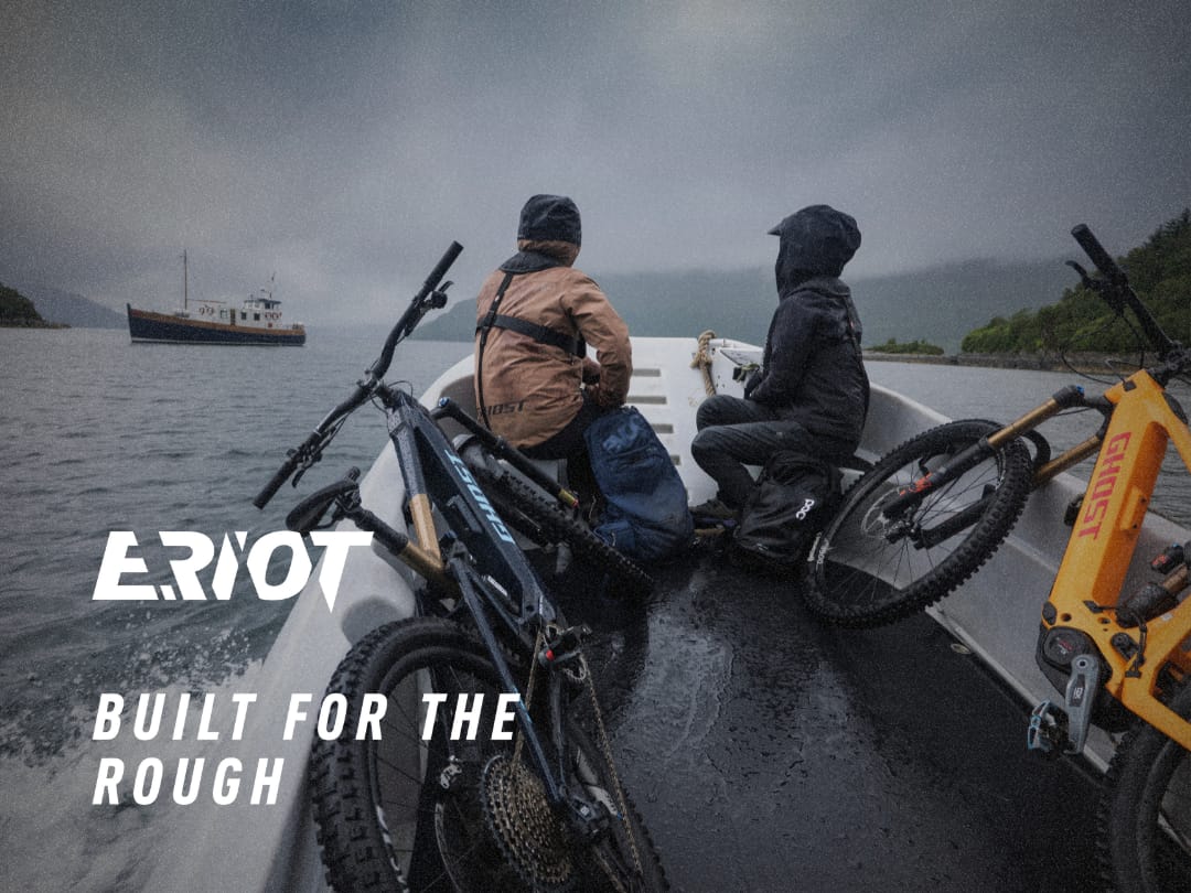
Ghost E-Riot Photo and Video Production
Concepted and led production end-to-end on a story-led launch film, delivering a hero video, 30 supporting assets and 150+ photos in a two-week turnaround.